Eco Move Responsive App
UI Case Study
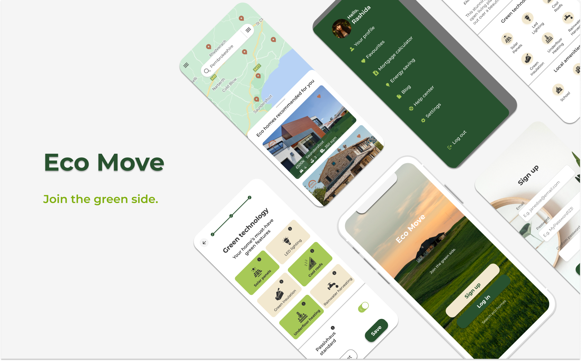
Overview: Eco Move is a real estate responsive web app for the eco-conscious. The platform exclusively features properties that meet the highest energy efficiency standards and lowest environmental (CO2) impact. This is a student project created as part of the UI for UX Designers course at CareerFoundry.
Objective: Provide property buyers with comprehensive information on properties of interest, as well as professional guidance and expertise needed to get started in the “green” real estate world.
My Role: UI Designer
Tools: Figma
Duration: May-June 2021
01. The Problem
Investing in real estate is an increasingly popular way for people to achieve financial security; in particular, as the global community becomes increasingly more eco-conscious, there is a growing interest in what are often referred to as “eco-homes”. Buying a property is an exciting experience but often complicated, especially for unseasoned buyers, who may struggle to get started and waste time viewing properties that don’t meet their requirements or turn out to be out of their range.
New buyers need access to reliable, uncomplicated information about their potential property investments - including insights into green technology and eco-features - in order to get a feel for a place before spending time on-site.
02. The Solution
A responsive web app aiming to help people find their dream eco-home by featuring exclusively properties that meet the highest energy efficiency standards and lowest CO2 impact.
Users can set their property criteria, search for specific green technology features such as solar panels and green insulation, as well as access relevant resources and information on these topics. Designed to help people invest in their future while being kind to the planet.
03. The User
Based on the research findings provided in the brief, the following persona — Rashida — was created. Once I had a better understanding of the app’s target audience, I selected three user stories from the project brief and mapped out a user flow to visualise her journey while using the app, including screens and interactions.
User Persona
Rashida is tech-savvy, eco-conscious, and family-oriented. Financial security and environmental sustainability are among her top concerns.
User Stories
As a user, I want to create a profile containing all my property criteria, so that I can see listings that are relevant to me.
As a user, I want to be able to easily search for and filter properties, so that I can find good matches based on my needs.
As a user, I want to be able to save properties I am interested in, so that I can easily revisit them.
User Flow
04. Initial Wireframes
Using the user flow diagram as a starting point, I sketched out some ideas on paper and then started wireframing the key features of the app in Figma. My main goal at this stage was to focus on the basic screen layout, essential copy, and the content required on each screen that would allow my user to get from one screen to another.
05. Design Inspiration and Moodboard
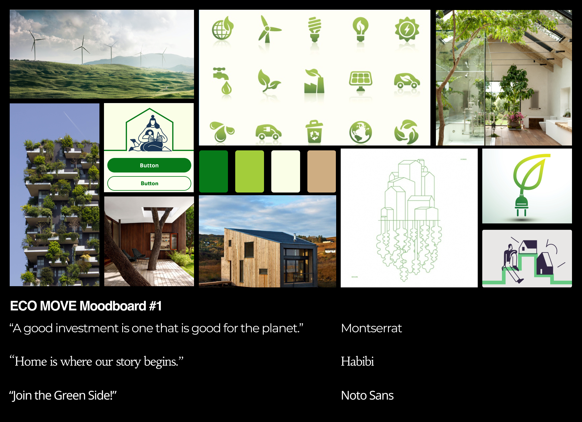
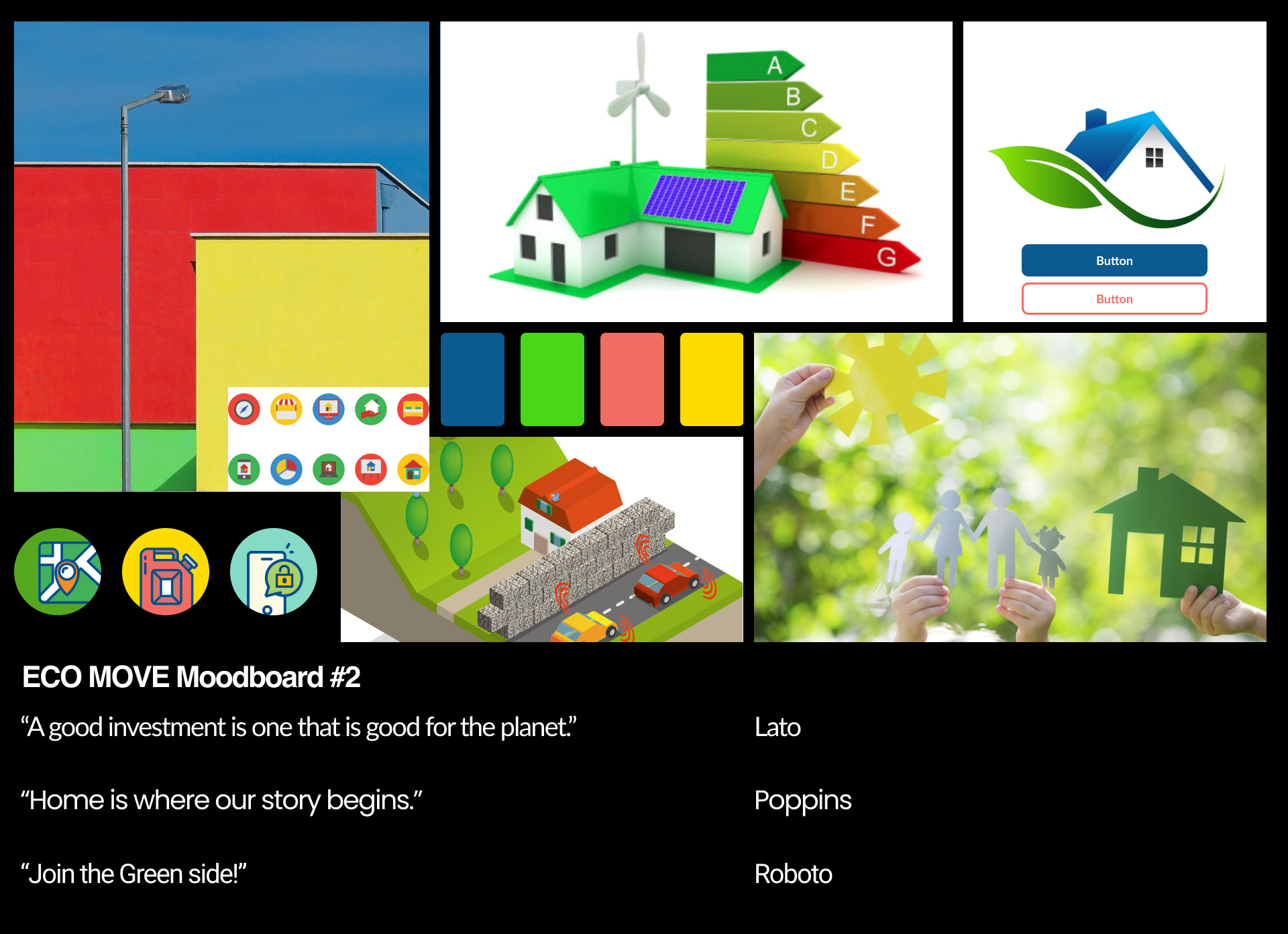
In order to define the visual direction for Eco Move, I started researching design trends in real estate, as well as eco-friendly businesses and organisations, taking into account important elements such as colour theory, typography, icons and photography. My goal was for Eco Move to evoke sustainability and love for the environment, as well as the concept of home and stability. I developed two different moods that could support this goal: one with a more modern feel (Moodboard 1), and another with a bolder, more playful aesthetic (Moodboard 2).
Eventually, I decided to go for Moodboard 1. While the second option is engaging and playful, I believe the purpose of the app is better conveyed by a calmer and more reassuring palette. Moodboard 1 is dominated by natural colours - green in particular, which is often associated with calm, safety and even new beginnings. The connection with the environmental cause is also very well expressed by this colour, as well as the other earth tones shown in the palette, which are evocative of eco-friendly materials such as wood.
A Note on Typography: Preference Testing
Between the moodboard and high fidelity wireframes stage, I looked at possible typefaces for Eco Move. After trying out a few different options, I narrowed down my choice to either Montserrat or Noto Sans. As I believed both typefaces were equally suitable, I decided to carry out a preference test with friends and family. Montserrat turned out to be the preferred choice. One of the participants mentioned that this typeface felt very airy and spacious, which reminded her of nature and therefore evoked the “eco” concept better. It was also considered more readable, so I was happy to proceed with this style.
06. High Fidelity Wireframes
At this point, I was ready to develop high fidelity wireframes for Eco Move: I defined typography, iconography, photography and colour palette for the app.
Profile Creation and Onboarding
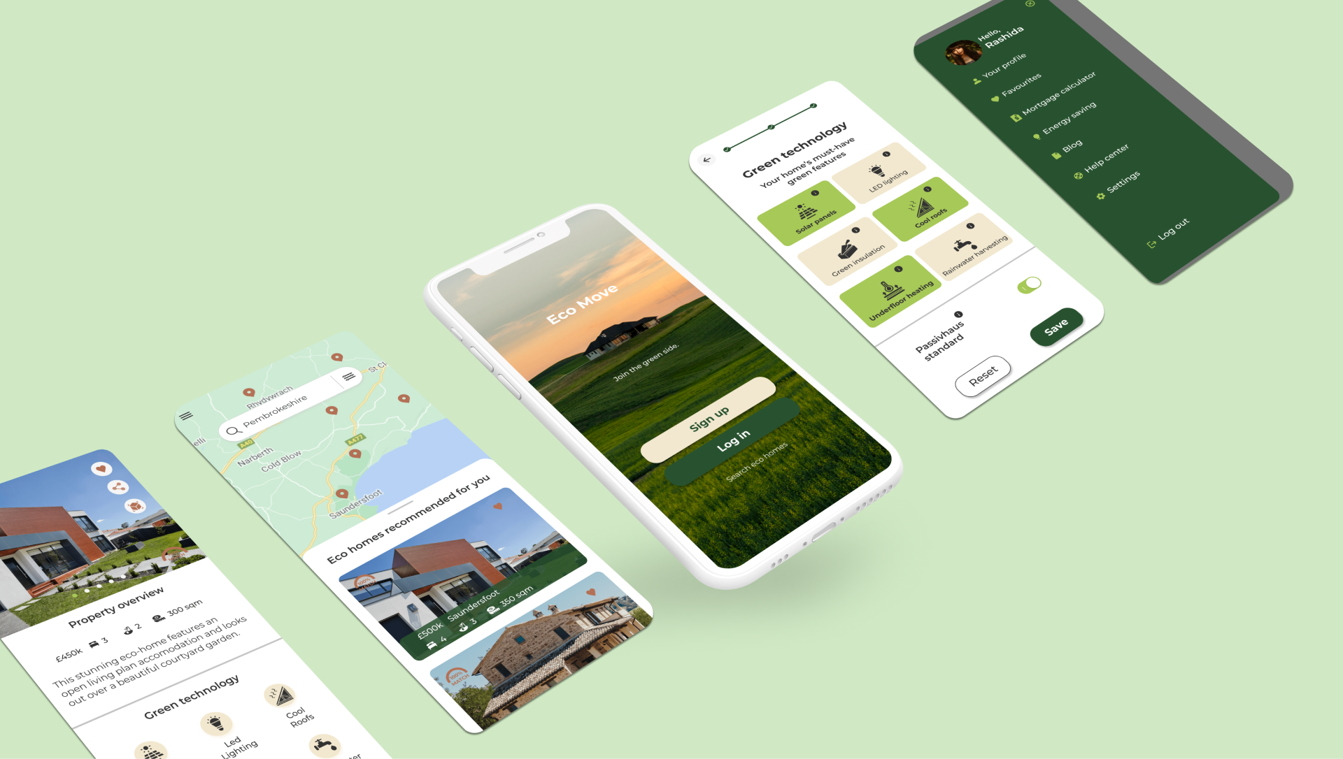
New users are encouraged to provide details on property preferences (type of property, number of bedrooms, price range, location) and desired green technology features. The info icon allows users to quickly access key information, so that users can make informed decisions without interrupting their flow.
Search Results
The app generates relevant results, providing by default a mix of map and list view, which the user can change to map- or list-only with a simple swipe up or down. The previews show key property info, such as price, number of bedrooms, bathrooms, location, and match indicator. Users can tap on the heart icon to add a property to their favourites, which they can access via the hamburger menu.
Property Details
An overview of the property including options to save, share via social media or email, and access a 3D plan view. Additional information on green technology and local amenities, with a clear call to action to contact agents.
07. Style Guide
A style guide was created to document all of Eco Move’s visual and UI elements, in order to ensure a consistent brand look and feel. The style guide includes guidelines on how to correctly use colours, typography, iconography, and imagery; it also illustrates all UI elements and patterns. For the full Style Guide, click here.

08. Responsive Design
At the outset, I adopted a mobile-first approach for this project. Since Eco Move is a responsive web app, my next step was to adapt the mobile designs for responsive breakpoints, including desktop and tablet.
09. Conclusions and Next Steps
This UI project was completed in the space of 6 weeks, and it gave me the opportunity to learn a lot about visual principles, typography, designing for different breakpoints, and even creating icons from scratch. Due to time limitations, it wasn’t possible to design or test additional features and screens - such as user profile, energy saving stats, and the remaining filter options. In addition, there are several next steps that I would like to take in order to improve Eco Move, including:
Usability Testing: the key next step for this project would be to carry out usability testing with potential users to gather feedback and ideas for future iterations
Icons: I would like to look into creating a brand new set of icons for the app, in order to improve visual consistency
Tablet & Desktop: I would like to complete the designs for tablet and desktop versions in order to explore all the possibilities that larger screens could offer, and of course test them with users, so that I can ensure a smooth experience across devices.


