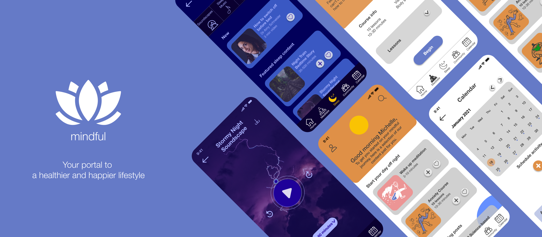
Mindful Wellbeing App
UX Case Study
User research, Ideation, Wireframing, Prototyping, User Testing, and UI design
Overview: Mindful is a web app used to meditate, listen to sleep content, and access science-based resources and tips on health and wellbeing. Users are able to schedule content, as well as connect with the app’s community via a forum.
Objective: Allow health-conscious individuals to log in to a responsive health and wellbeing portal to record their health information, as well as access general wellbeing features.
My Role: UX Designer
Tools: Figma, Optimal Sort, Usability Hub
Duration: November 2020-March 2021
The Design Thinking Process
To create Mindful, I followed the Design Thinking Process. This methodology allowed me organise and plan the different stages of my design - from defining a problem space to testing prototypes.
01. Understand
The Problem Statement
Our users need a way to record and track their daily moods and feelings, as well as to educate themselves and engage in helpful, mindful activities because they want to monitor their mental health and wellbeing in order to achieve a healthier and happier lifestyle.
We will know this to be true when we see how many people use the app to track their health and engage with helpful, tailored content in the resources provided.
SWOT analysis for Headspace.
Competitive Analysis
The next step involved learning more about potential competitors in the health and wellbeing industry, so I decided to take a closer look at two competitors: Daylio and Headspace - for an in-depth analysis, visit this link.
Looking at these products allowed me to get inspiration for my own project as well as identify areas of improvement, such as providing educational, science-based content, a well-organised and functional web platform (in addition to mobile), and an easy-to-use, decluttered interface.
Next, I wrote a Business Requirements Document, a high-level overview of what the app is meant to do, introducing the intended target audience, and exploring risks and opportunities. Read the full document here.
02. Observe
Affinity mapping showing interviewees’ needs and goals.
User Interviews
As I started recruiting participants for interviews, I defined 3 research goals:
Find out needs and pain points for people who use existing mental health and wellbeing apps
Gain insights into user behaviour around mental health and wellbeing
Identify specific tasks users might want to perform with my app.
I then carried out interviews over Zoom with 4 people from my target audience: health-conscious adults aged between 27 and 37 who had previously used wellbeing apps.
Research Analysis: Key Insights
NEEDS & GOALS
The participants…
Don’t need/want to track their mood
Want to be able to build a wellbeing schedule
Want to have access to actionable science-based content
Want to engage with content clearly addressing specific problems (sleep, anxiety, stress, etc.)
Need to interact with a community to feel supported
FRUSTRATIONS
They're annoyed by
Repetitive content
Content overload - too much content feels overwhelming
Expensive apps
Simplistic content using condescending tone (supermarket psychology)
WELLBEING ACTIVITIES
They practice
Meditation - mentioned by all participants as their primary wellbeing activity
Yoga and other physical exercises
Breathing exercises
03. Point of View
User Personas, journeys and flows
MICHELLE
Michelle represents younger users: she’s an extroverted person who juggles work and study. As a sociable individual, she values people’s input and wants to connect with other users. Her main goal is to improve her sleep.
An overview of Michelle's persona.
Michelle's journey looking for sleep content.
User flow showing Michelle's steps and interactions to complete her desired task.
COSTANZA
Costanza is a few years older; a busy professional with a demanding schedule, she values efficiency and well-curated content backed up by science. Her main goal is to fit wellbeing activities into her busy calendar.
An overview of Costanza's persona.
Costanza's journey adding meditation content to her calendar.
Steps and interactions Costanza goes through to achieve her goal.
04. Ideate
Sitemap
I tested my first sitemap by carrying out a closed card sorting exercise with 5 participants. For the most part, the exercise validated the hypotheses made for the original sitemap, which remained mostly unchanged.
First Sketches
I decided to go for a bottom navigation bar to enable users to easily access and switch between the main categories of the app - meditate, sleep, community, and calendar - as well as Search. At the outset, I imagined a double navigation bar that would give access to the app’s sub-categories, as shown in the sketches below.
Accessing Forums subcategory from the double navigation bar.
05. Prototype
Low-Fidelity Wireframes
I then translated high-level design concepts into low-fidelity wireframes, simulating how the main features would work: the image on the right illustrates the first low-fidelity prototype of the calendar feature, showing how to search for and schedule an activity.
High-Fidelity Wireframes
The next step involved converting low-fidelity wireframes into mid and then high-fidelity (for mid-fidelity wireframes see section 9). Some of the changes made include:
Replaced the double nav bar with a filter/button solution at the top of the screen: I decided that the second navbar would have taken up too much screen space
Added home button to the navigation bar
Moved Search next to profile to make room for the home button
Presented content vertically rather than using a carousel to increase discoverability.
At this stage, I also began experimenting with colours; however, I decided to test my designs in greyscale, so that participants could focus on the information architecture rather than visual elements.
High-fidelity - colour version
High-fidelity - greyscale version
06. Test
Usability Testing
My main goals were to evaluate the usability of my prototype and observe how easily a first-time mobile user would understand and interact with the basic features and navigation of the app. For a full test plan, script and report, visit this link.
Methodology: Moderated remote tests (video and audio recorded)
Participants: 6 participants aged between 27 and 37. Some participants had been previously interviewed during the generative research phase of the project. For demographic information and schedule, visit this link.
Metrics & Frameworks:
Errors: Jakob Nielsen’s scale, a four-step scale used to establish the severity of usability problems.
Satisfaction: Single Ease Question (SEQ) after each task and at the end of the test, using a scale of 1 (very hard to use) to 7 (very easy to use).
Reporting findings: Rainbow Spreadsheet, a flexible framework that allowed me to easily visualise participants’ behavioural patterns.
SUMMARY: MAKING CHANGES
All participants found Mindful overall easy to use and understood its purpose and value. The overall satisfaction rating was 6/7.
After the tests, I sorted all my notes on each participant into observations, positive and negative quotes, and errors.
I then added the most critical notes to the Rainbow Spreadsheet, included error ratings and possible solutions. I then revised the prototype starting with the most severe errors.
A key insight came from participants’ negative quotes: most users found my prototype rather text-heavy, which I marked it as a high priority issue.
Preference Test
During usability tests, I noticed that 2 users were hesitant when interacting with the first screen of the onboarding (Option A), so I decided to test it against a new version: Option B features a different positioning of the Ask away and Skip options, as well as a rounded shape of the button. I used UsabilityHub to conduct the preference test. The participants included 10 CareerFoundry students and 2 people from my personal network.
RESULTS
83% of the participants preferred Option B due to a more intuitive positioning of the Ask away button and Skip, which successfully prioritises the options available and invites users to engage with the onboarding process.
07. Style Guide
For Mindful’s visual design, I decided to go for a relaxing and playful aesthetic, accompanied by a friendly, science-based approach. See the full style guide here.
08. Designing for Accessibility
After gathering additional feedback from my peers, tutor and mentor, I made a few significant changes to my mockup to improve accessibility.
09. Iteration Process
Looking back on my process, I noticed that the biggest challenge for me was to figure out how to simplify certain screens — particularly the home screen. In the early stages, I wanted users to see the whole range of content available as they opened the app, which led me to design busier screens. It took me some time and practice to figure out how to organise content and distill information in a way that wouldn’t be overwhelming.
The iteration process has taught me to be mindful of cognitive load and always keep in mind what features the user may or may not need at a specific stage of the flow: keeping things simple is key to a harmonious visual design as well as a successful user experience.
Next Steps
The iterative process teaches us that there’s always room for improvement. Here is a list of possible next steps to improve Mindful:
Add a live group meditation feature, which might keep users motivated as well as strengthen the community
Carry out a preference test for the current home screen and an illustration-only version
Develop user profile, making sure to include ways for users to track their stats, see their progress, and possibly set goals.

10. Conclusions
Mindful was my first major UX project, and as such, it has taught me a lot. Something that really stood out for me is the importance of user research and testing, and how these steps have shaped my project in unpredictable ways: I first started this project with a mood-tracking app in mind, and thanks to my interviewees’ insights, ended up with a completely different product. Like in all things, however, there needs to be balance: while it is important to recognise the value of users’ feedback, it is also crucial to know when making revisions is actually necessary, or if it’s just a matter of personal taste. Something that I found particularly rewarding was working on Mindful’s visual design, as well as finding solutions to improve accessibility: these are two fascinating areas I would definitely like to learn more about in the future.
Credits
Thanks to everyone who has helped me with this project: my tutor Duong Le and mentor Derek Mei from CareerFoundry, as well as everyone who participated in user interviews and usability testing.
-
Illustrations: Pablo Stanley & Afsar Hossen
Icons: flaticon.com / freepik
Pictures: unsplash.com


